How we did it.
This beautiful London Townhouse is occupied by a couple in their early 40s, their pre-teen daughter as well as an elderly parent. It is a house on multiple half levels.
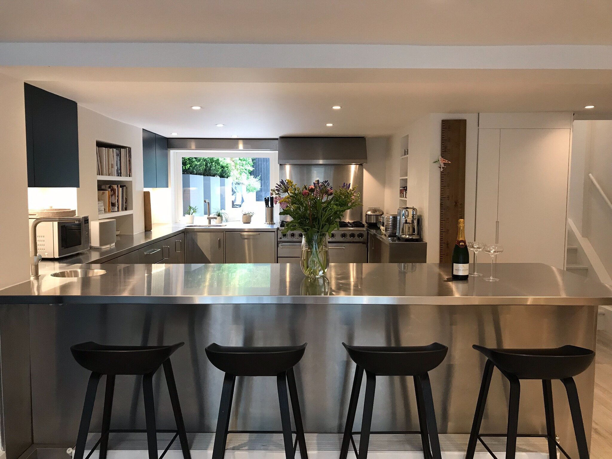
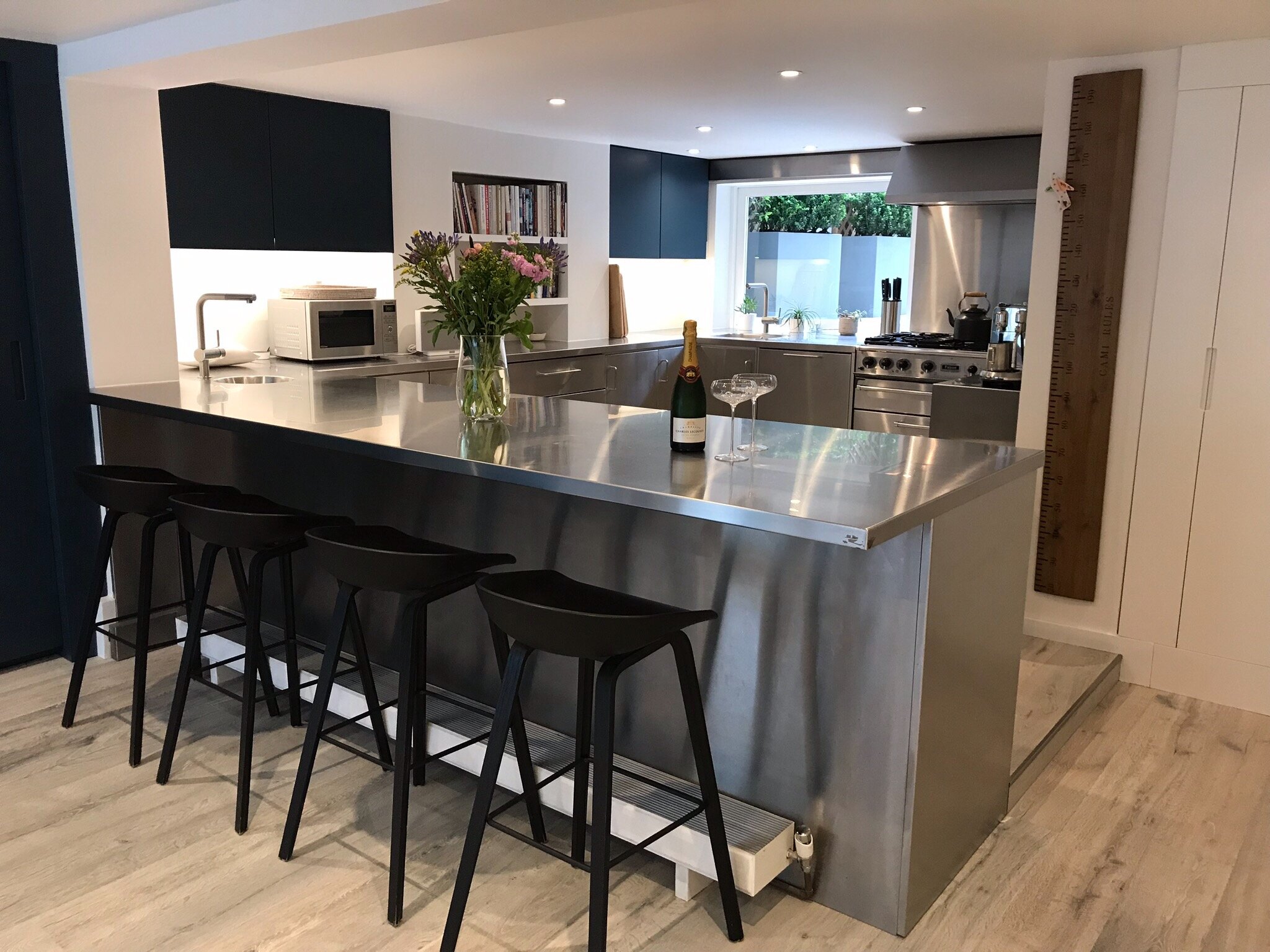
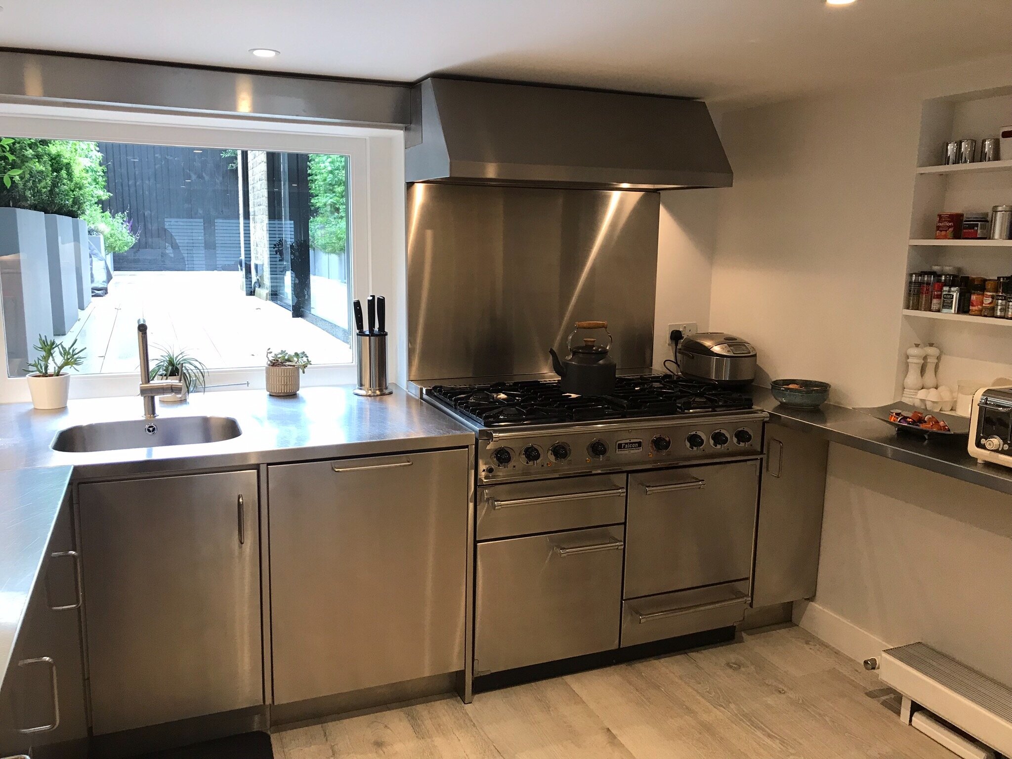
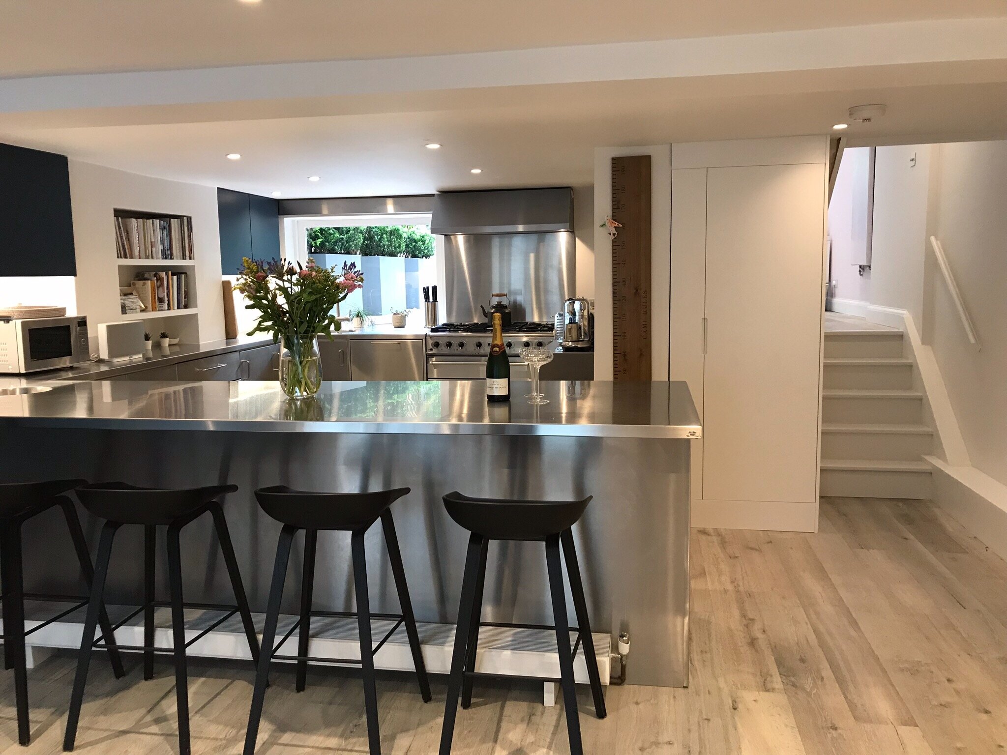
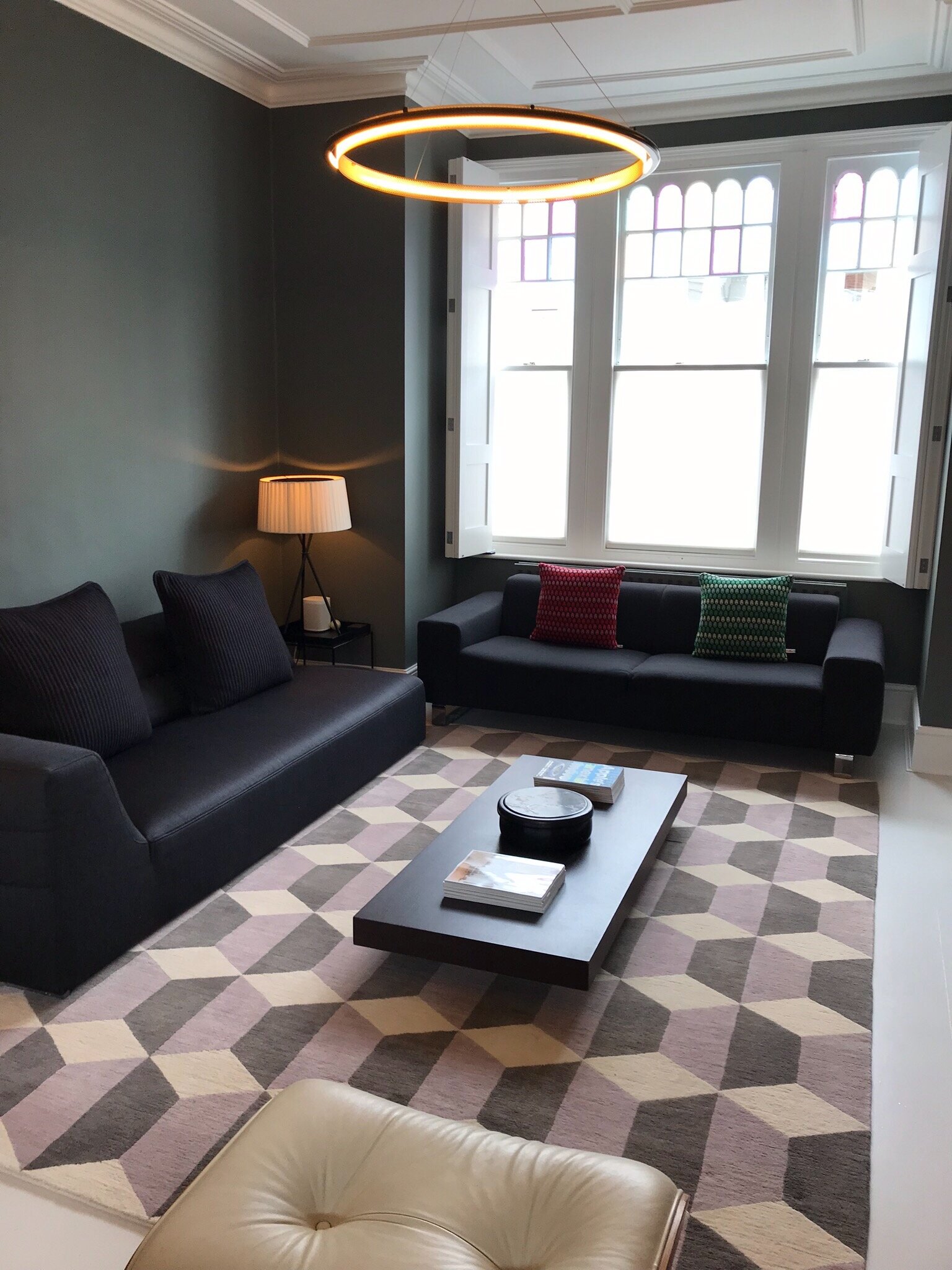
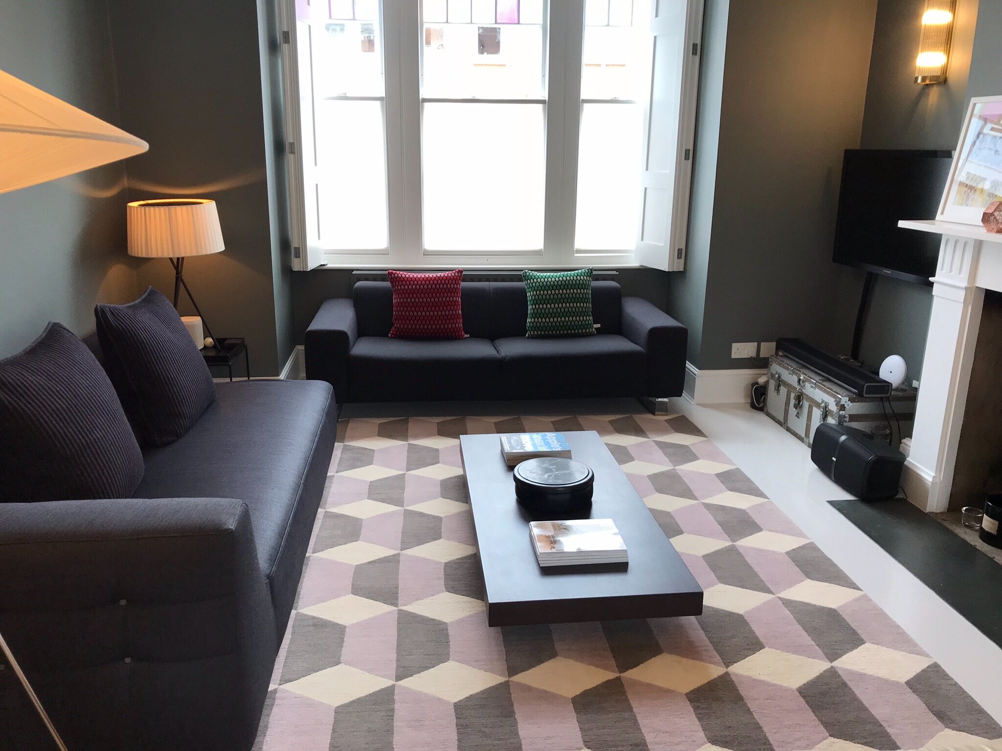
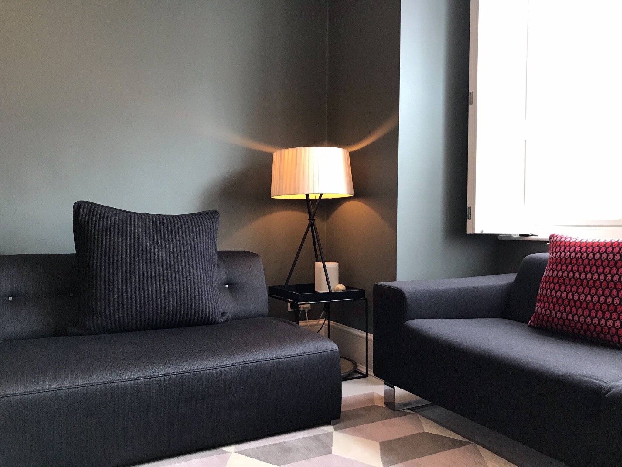
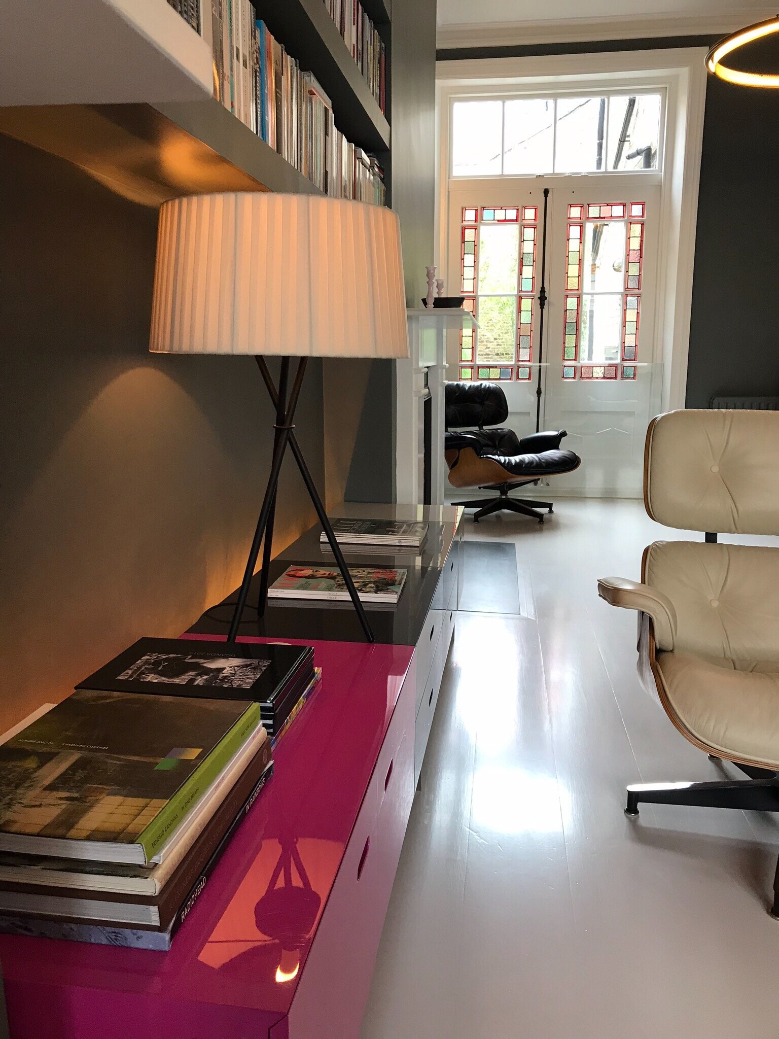
My clients’ taste had been a grey and white palette, lots of metallic objects and metallic pieces of furniture. The feeling in the house was a bit drab, especially on a rainy London day.
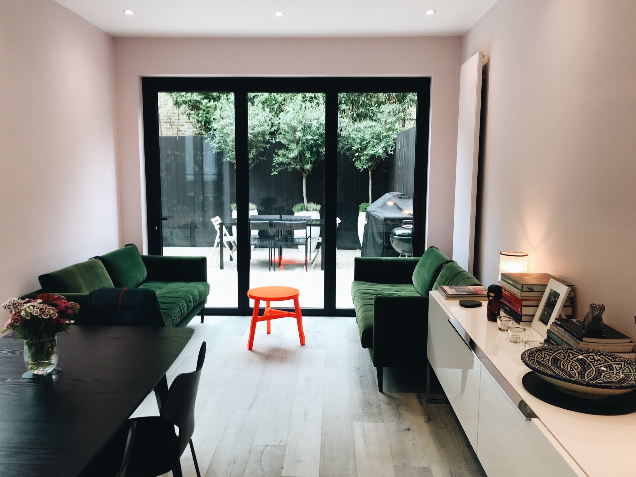
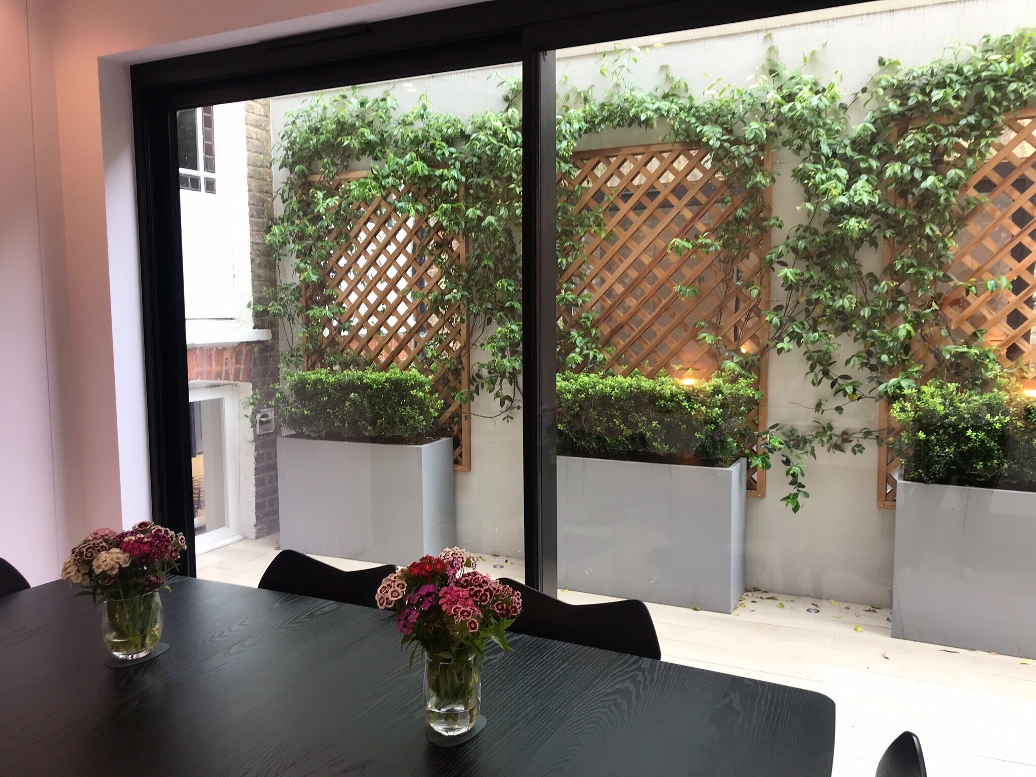
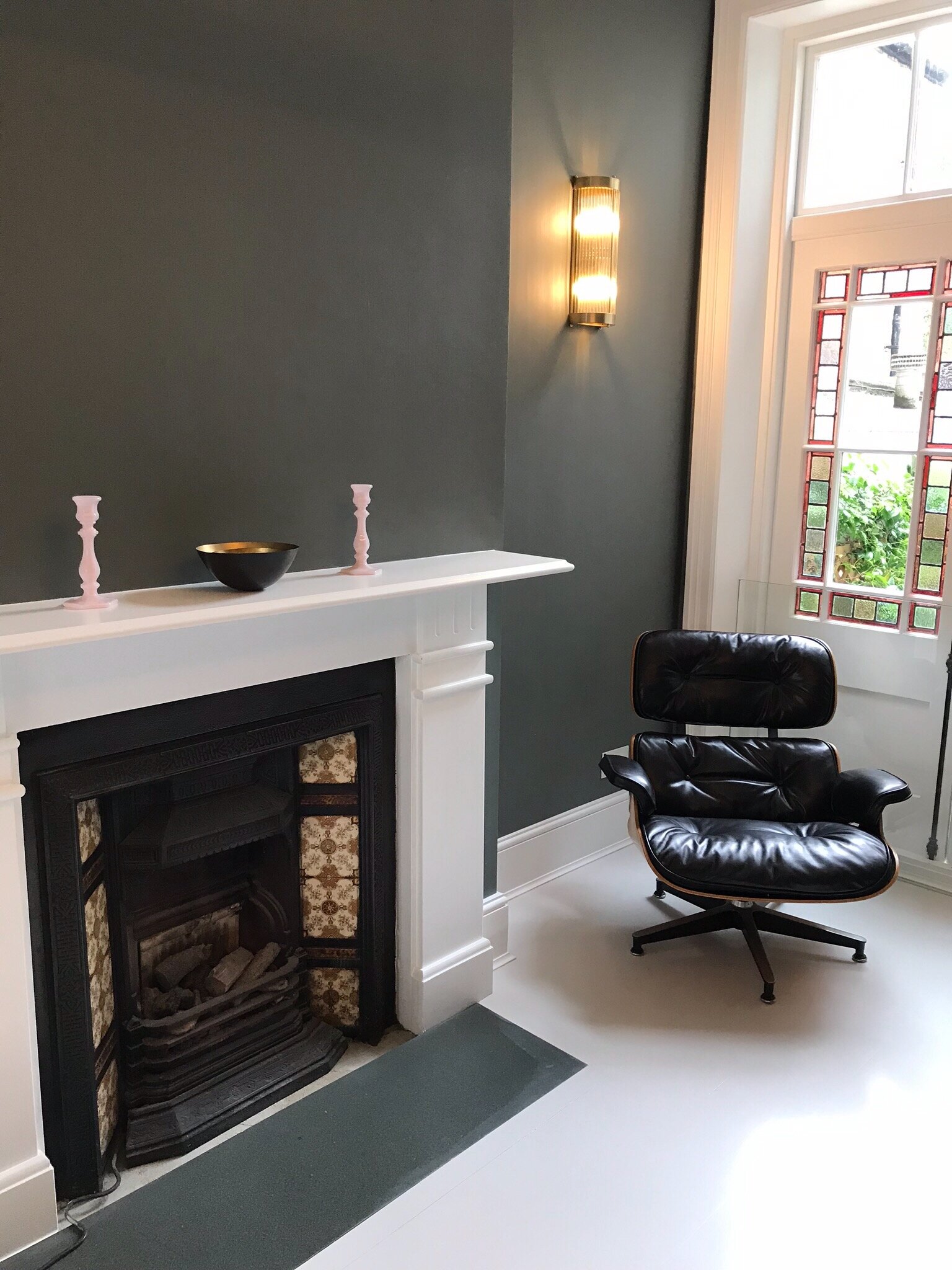
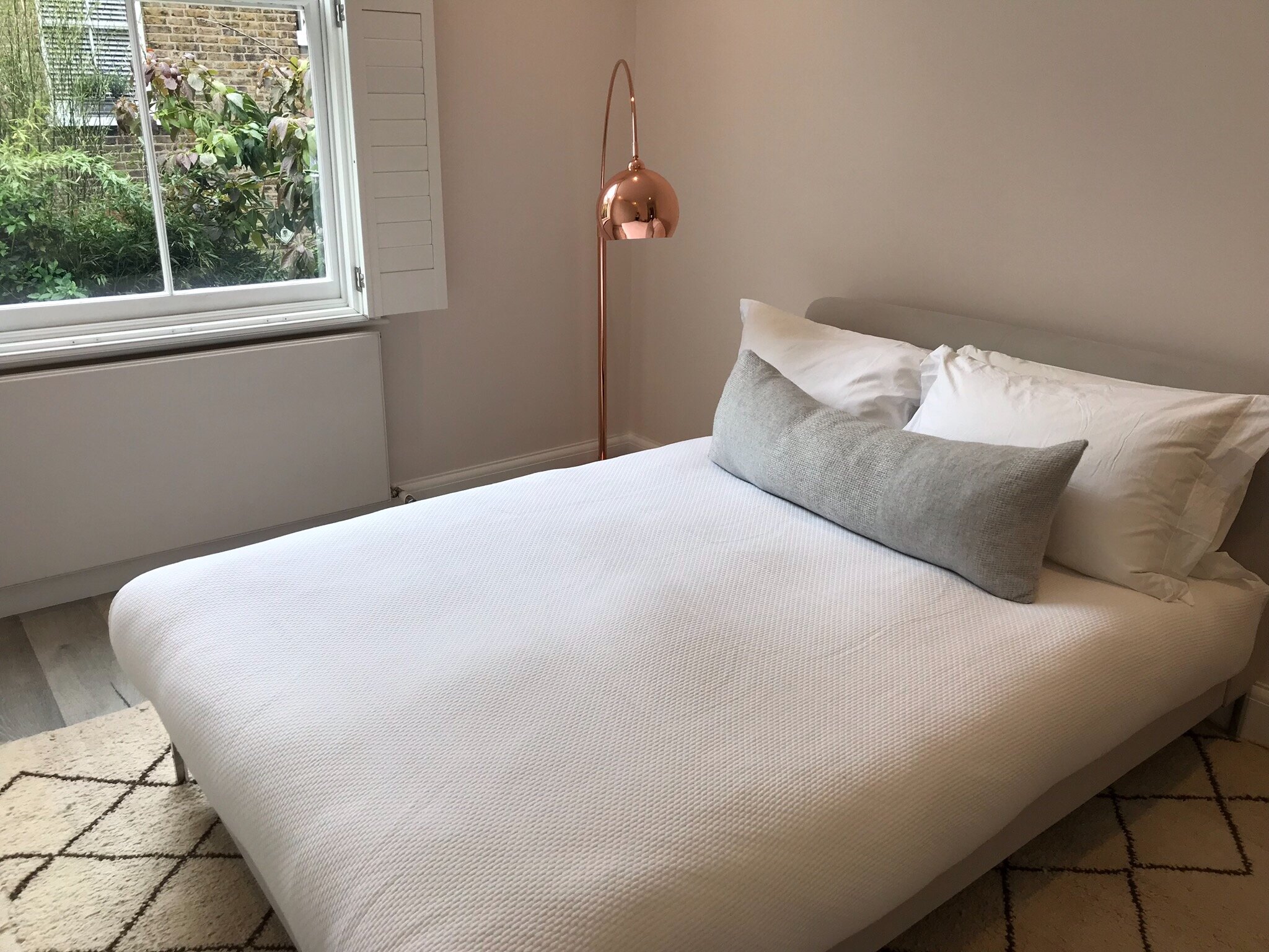
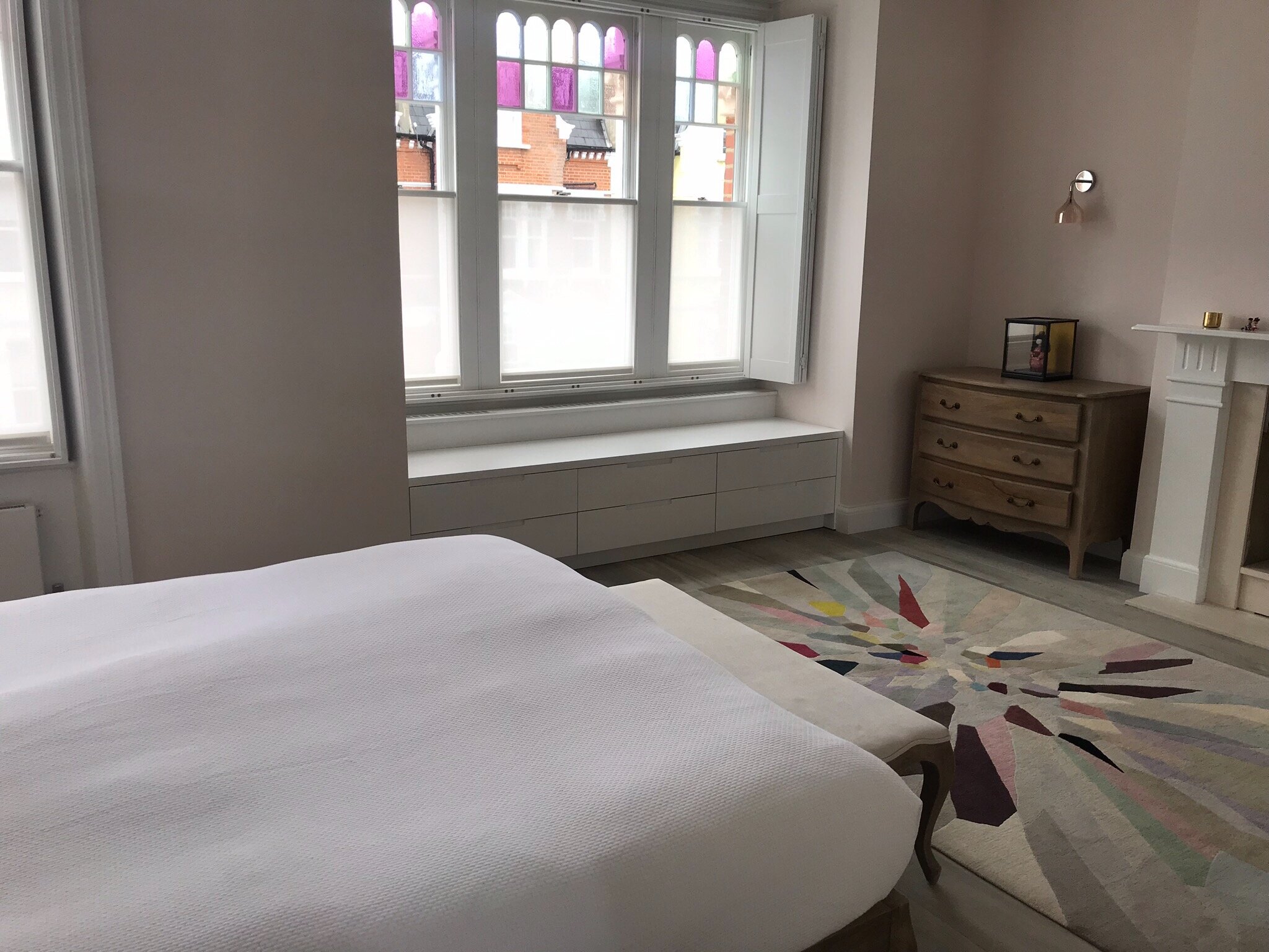
It was important for me to respect their taste in metallic objects, while at the same time introducing a different vibe through more playful colors (blush, green, orange, hot pink) that could reduce the “Metal” element, so they could experience a different kind of house with a feeling of togetherness and more playfulness. In addition, grey and white actually clashed against my clients’ birth elements which are Earth and Wood, so I had to urgently add back those elements!
Challenges:
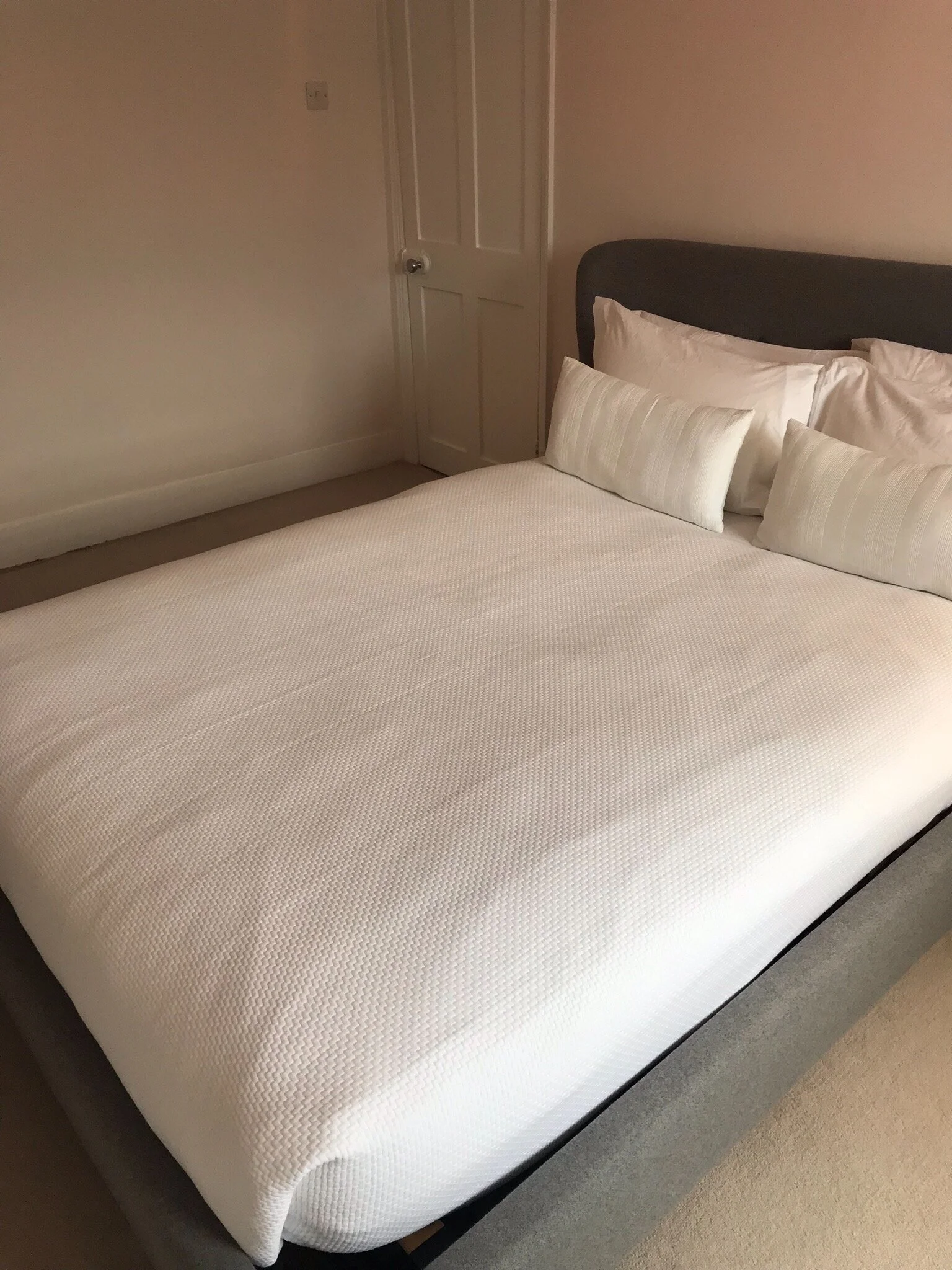
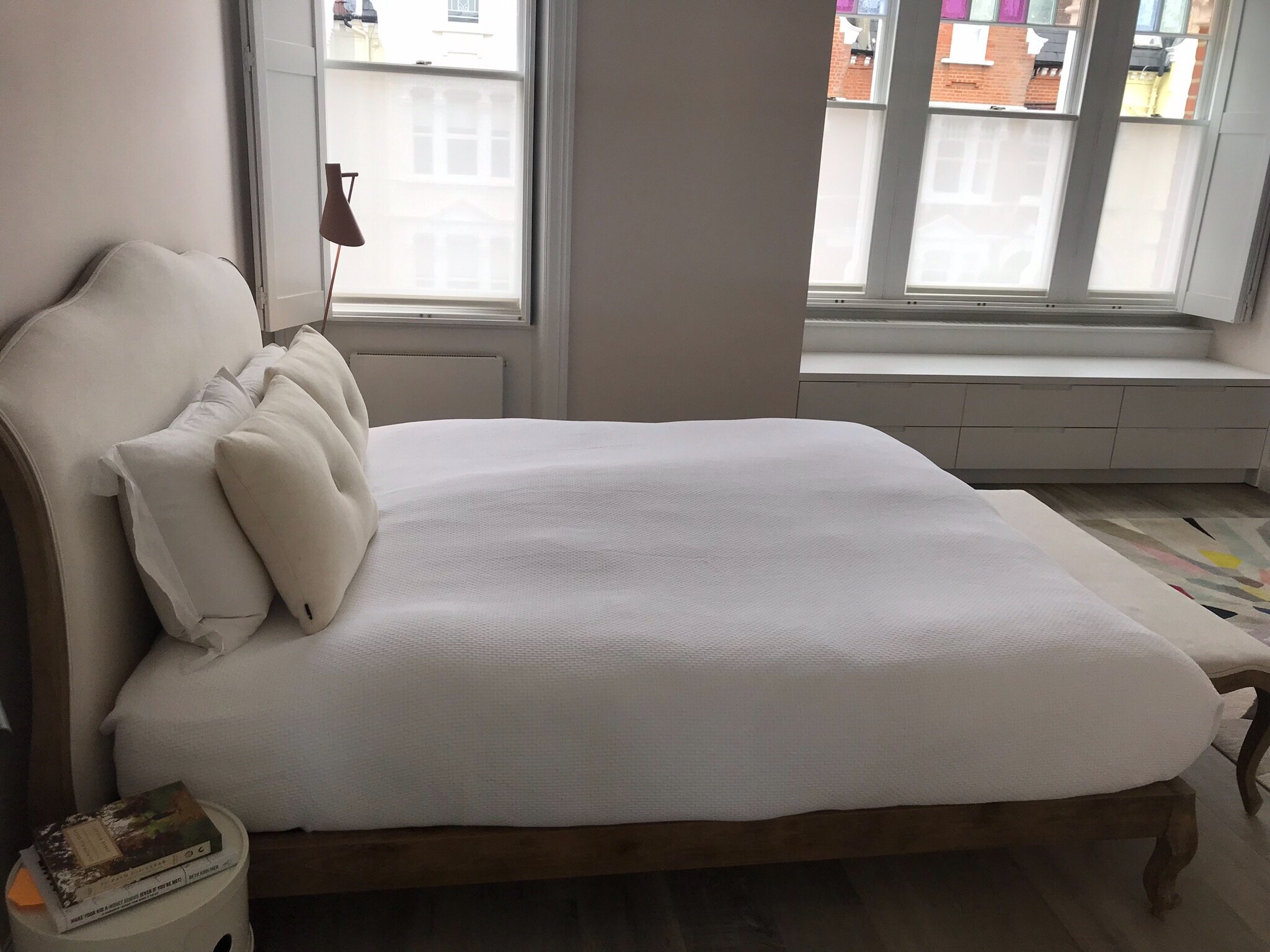
My client loves grey and white (Metal). While grey and white are very stimulating and good in an office, I don’t recommend it in areas where rest and togetherness are important (bedrooms, living rooms, etc.). More fire, wood and earth were needed in those areas.
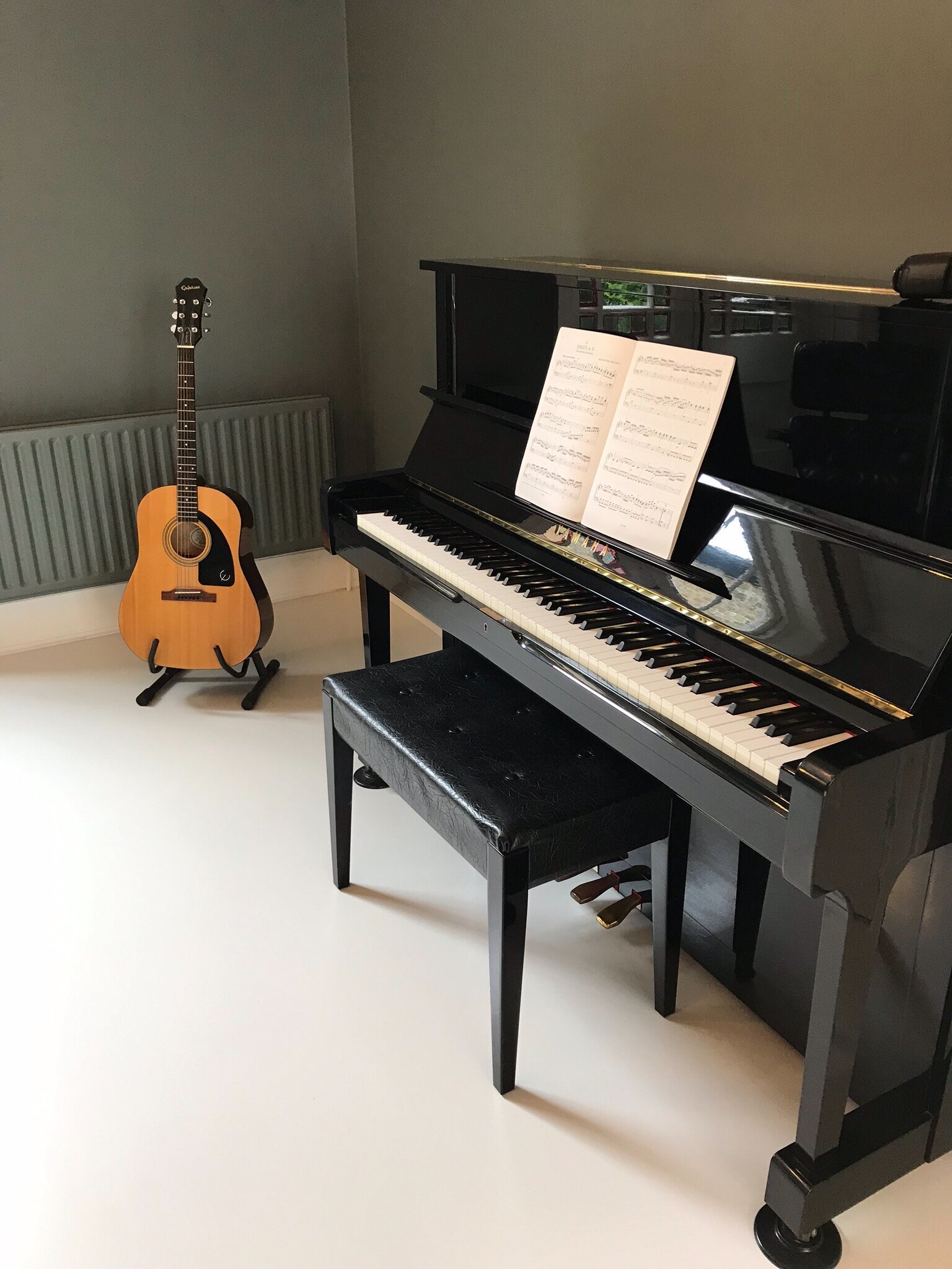
Because my client was a creative person at heart, but had not created in a while, I was eager to introduce more wood and some water in some areas, and removing some metal because Metal is too conducive to left-brain thinking… and not so much for right-brain (creative) thinking.
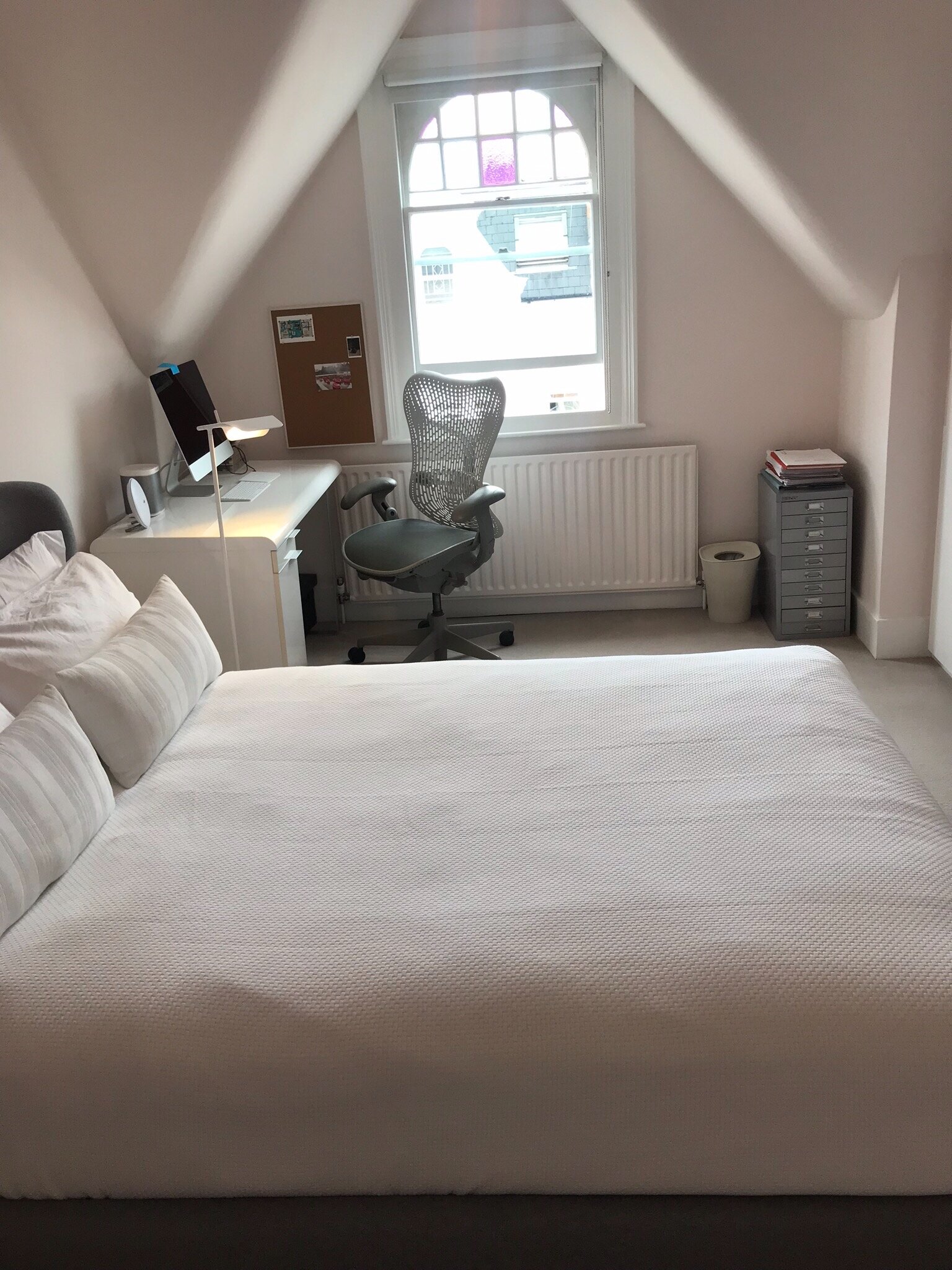
I had to find ways to brighten her house in some of the rooms especially the North, NW and NE rooms.
My contribution:
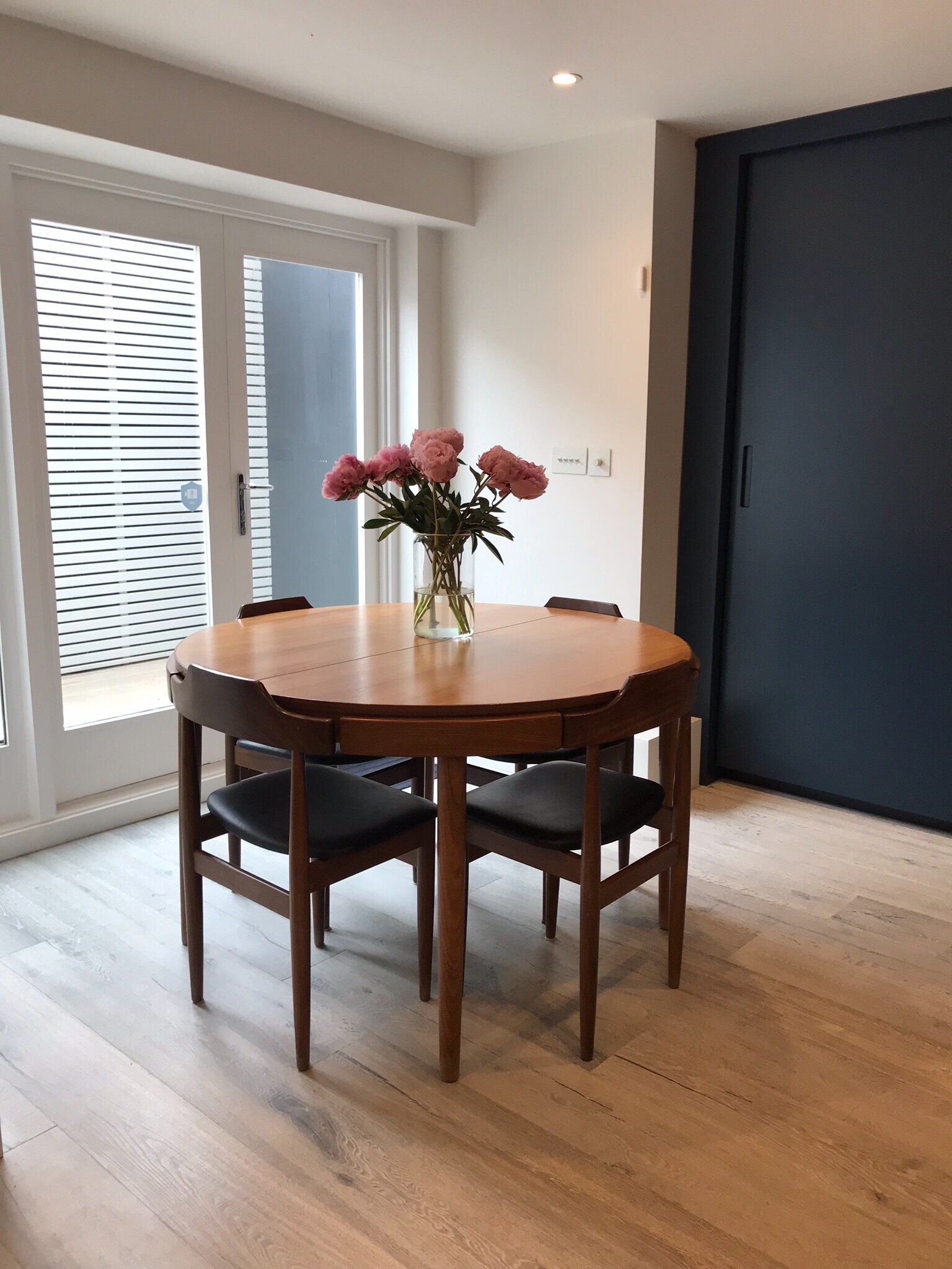
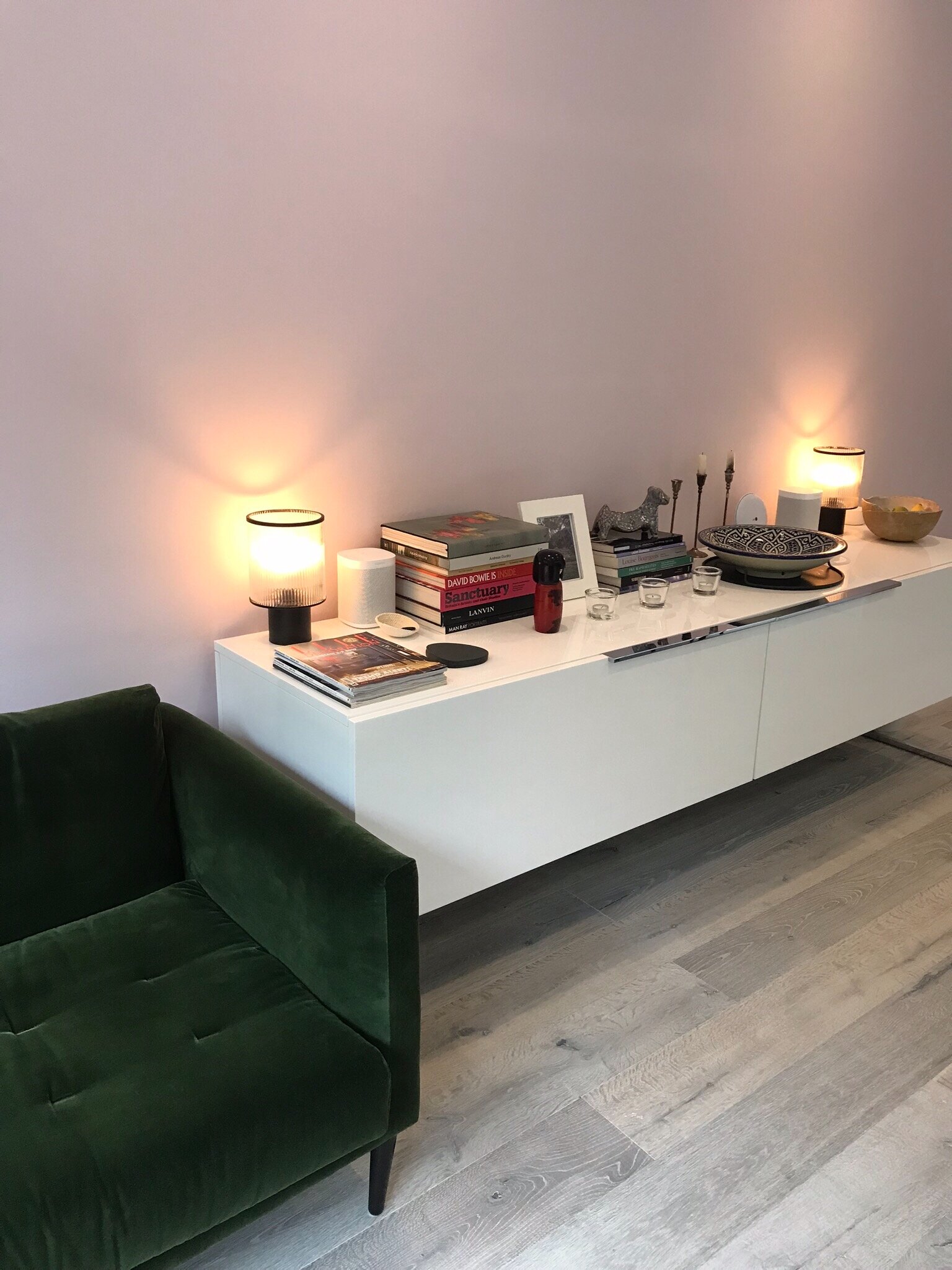
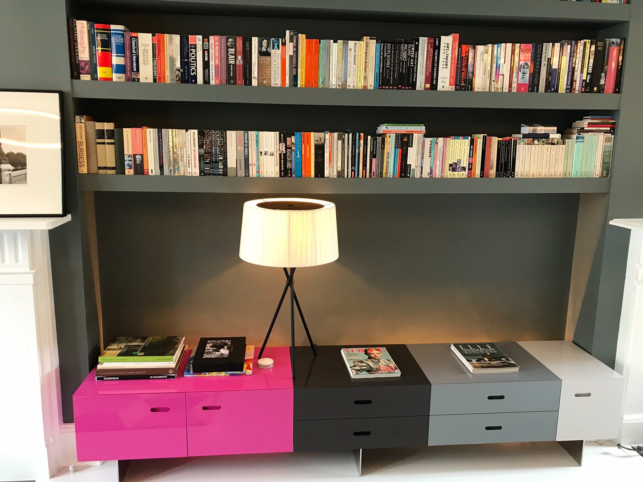
We combed through her existing furniture and collected art. A lot of the art was picturing single women, or women with kids, but no couples or families together. We were able to keep a lot of the existing furniture and art.
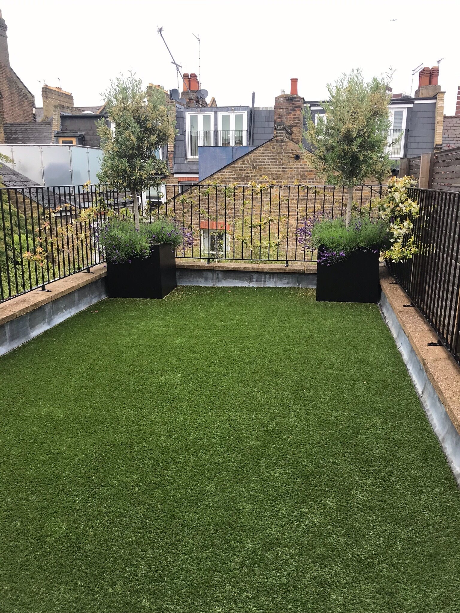
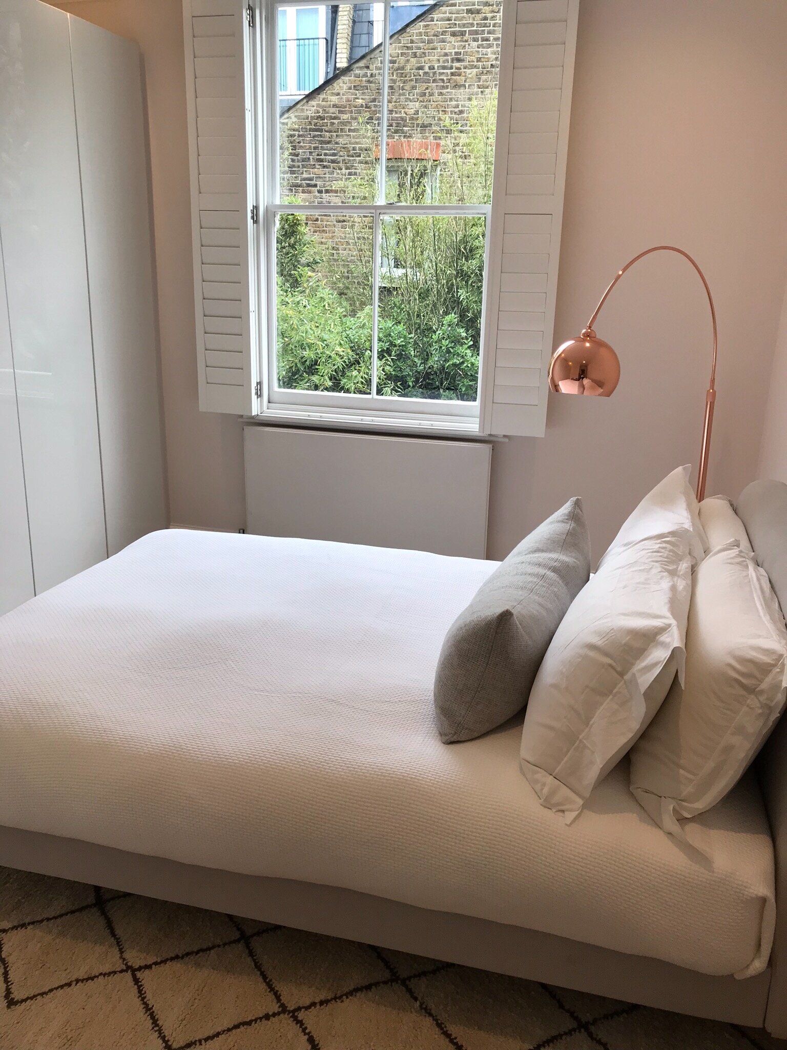
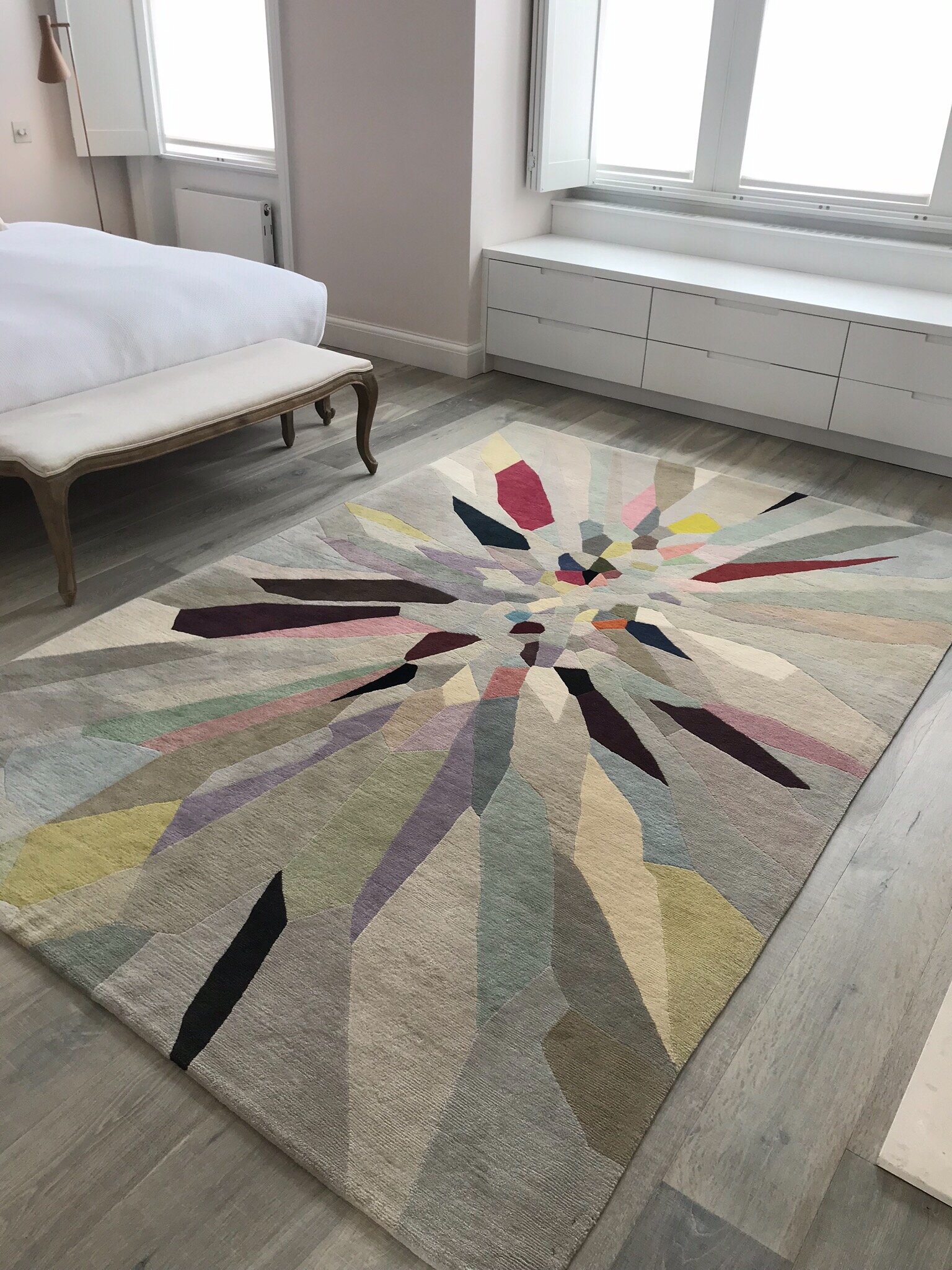
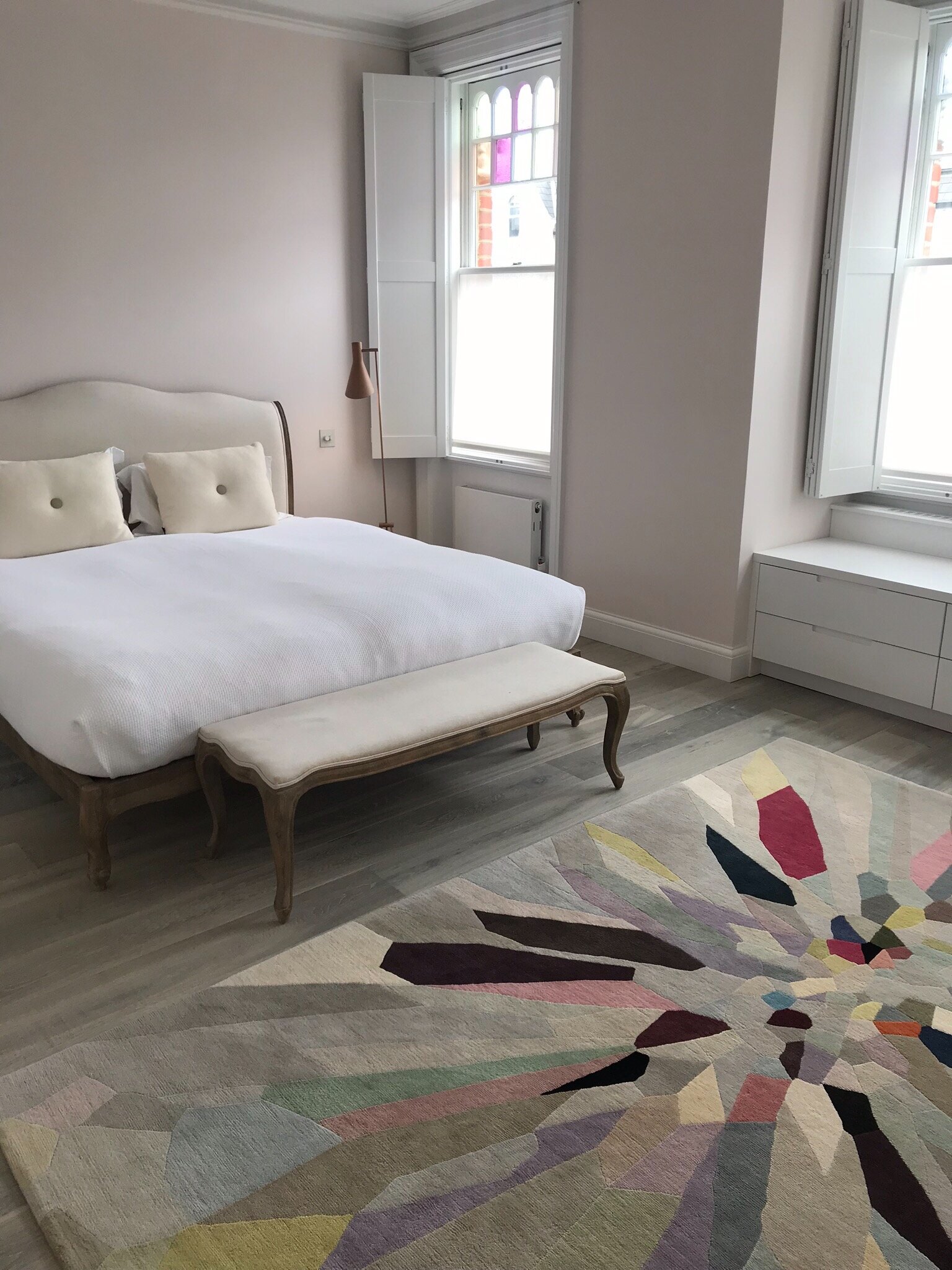
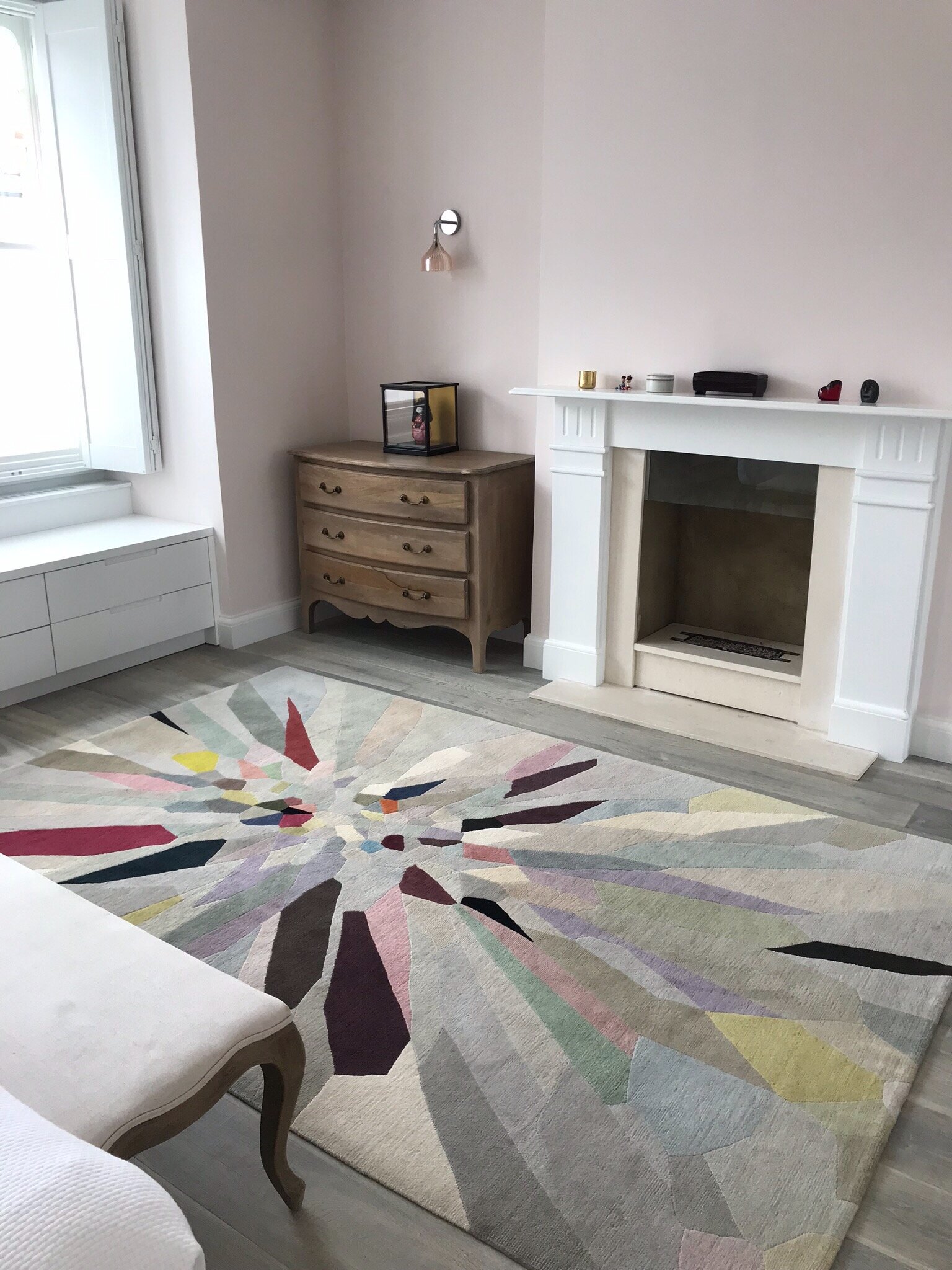
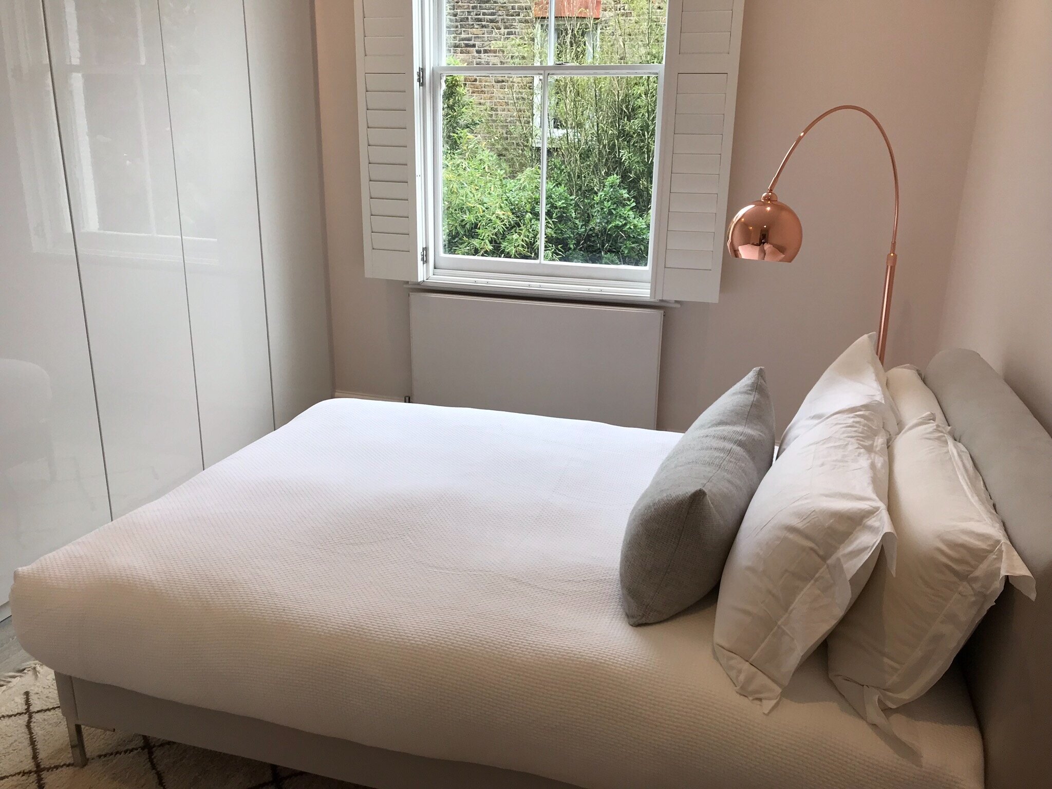
Adding Wood (the color green, a lush outdoor space) and Fire (with lights, candles, hot pink, orange and red, leather, art representing animals) was essential in order to "minimize" all the surplus of Metal and "burn" some of the stiffness/coldness associated with the Metal element.
I suggested displaying art, clothes and musical instruments conveying playfulness and fun.
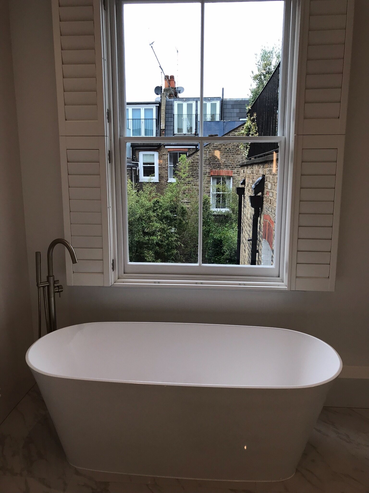
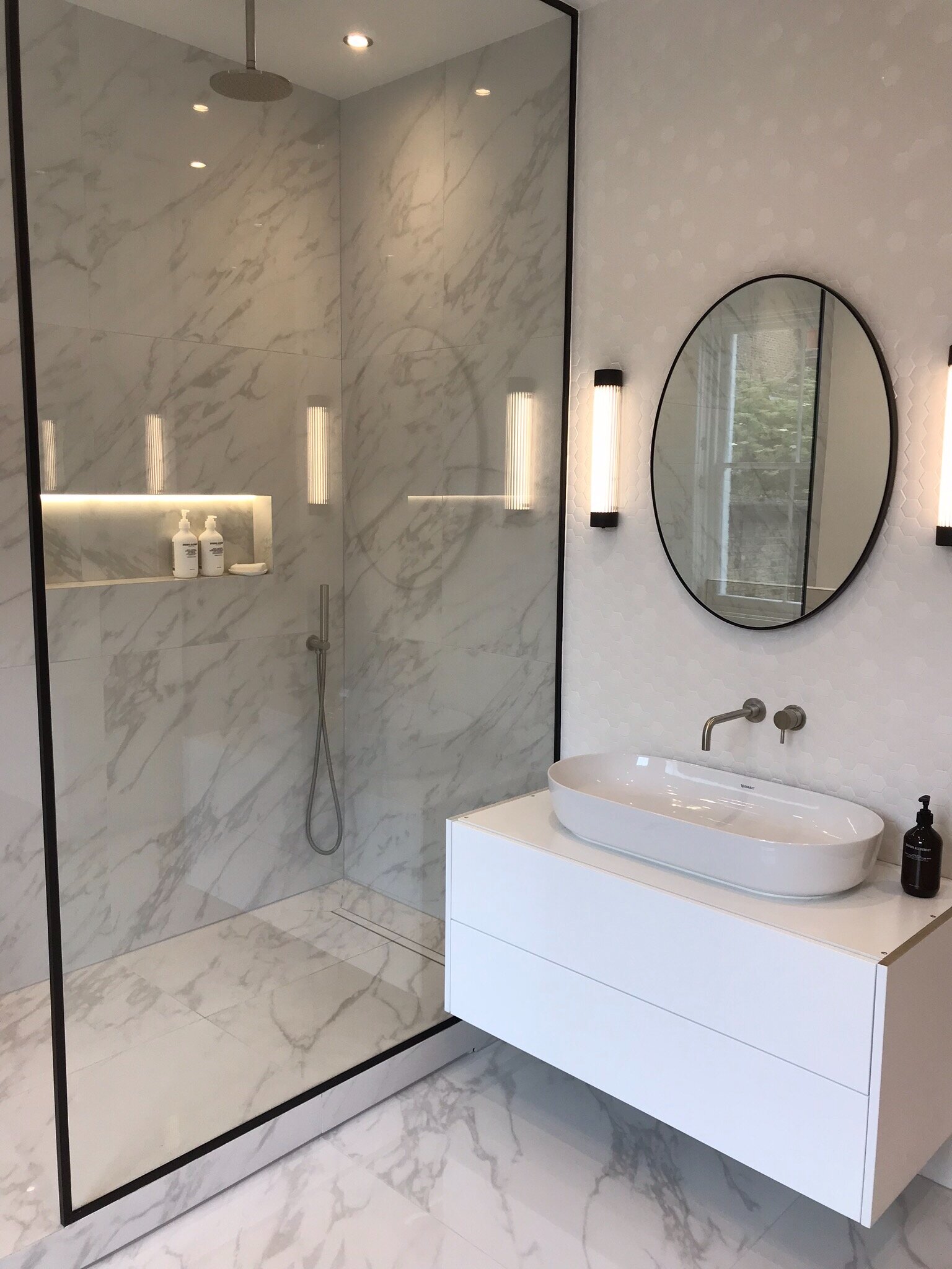
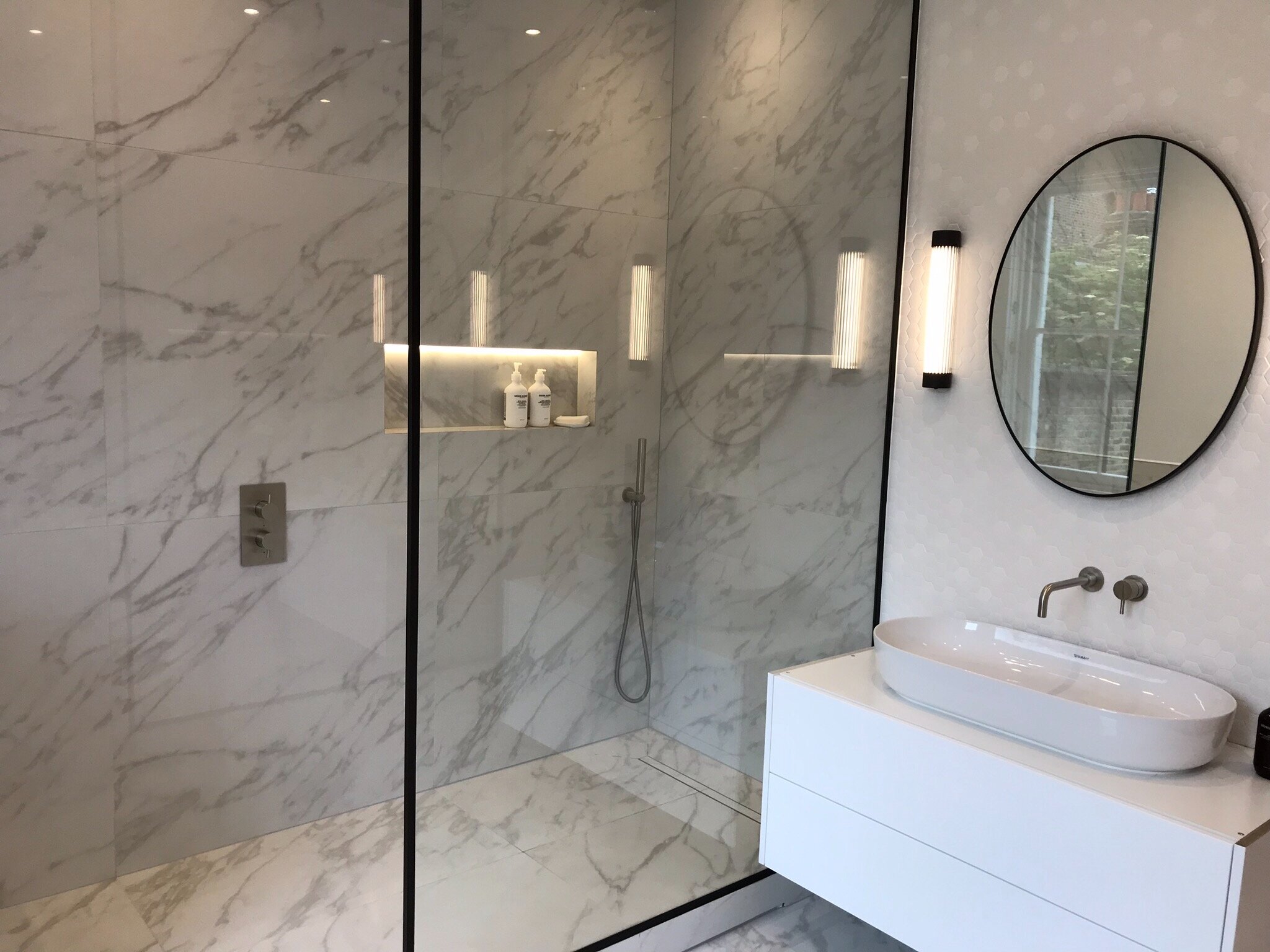
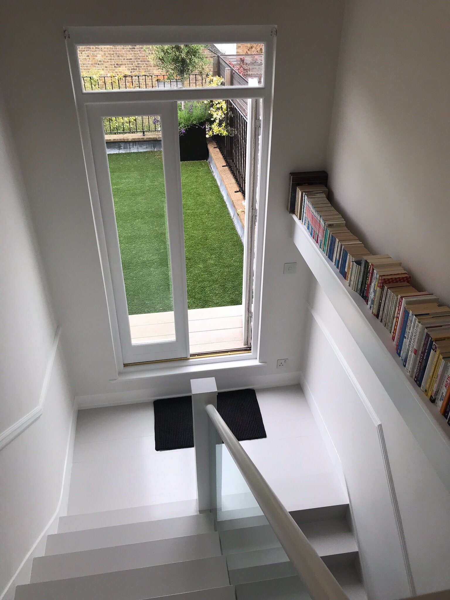
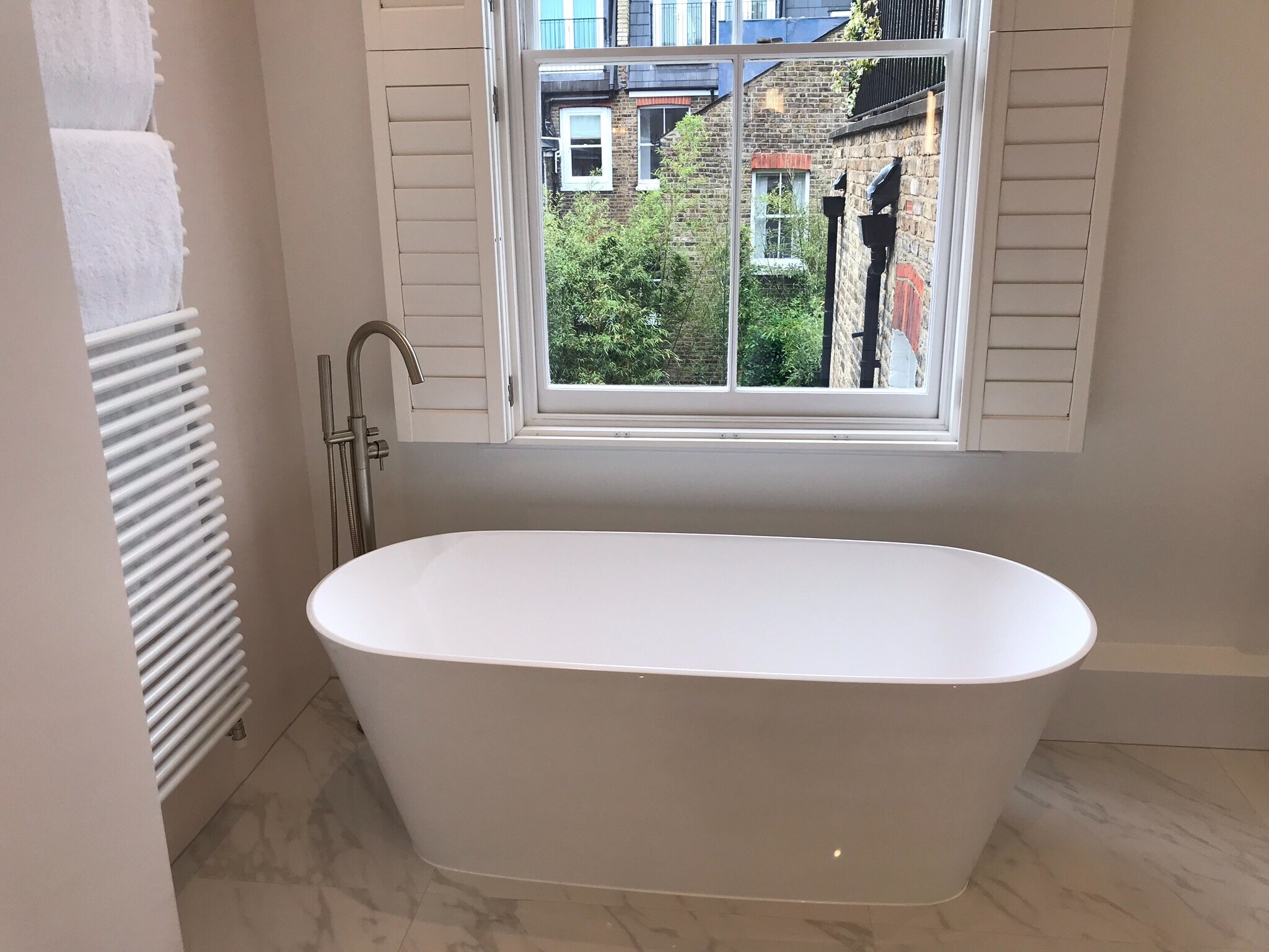
In some cases, like in the very metallic kitchen, we added the Water element with dark blue accent walls (Water reduces Metal). In other areas, like in the bathrooms, blush pink was used for the walls and plants were displayed in bathrooms.
We picked rounded shapes in order to soften the straight lines.
Results:
My client is thrilled with the changes we made in a relatively short time and is reportedly back to writing and being more creative. The whole family is thriving.
Gallery